


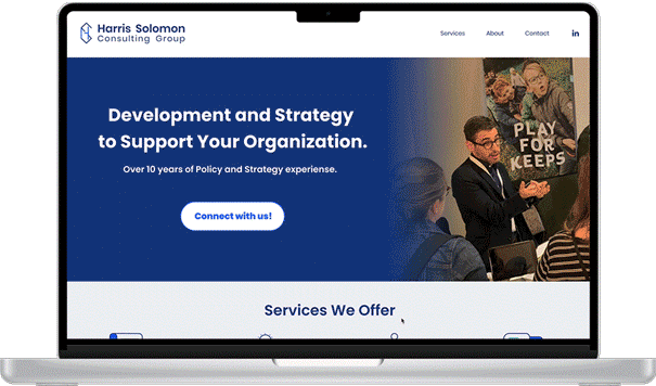
Harris Solomon Consulting Group
This branding strategy and website jump-started a new consulting business and increased its client count by 33%.
Involvement:
Strategy
Branding
UX Design
UI Design
Prototyping
User Testing
Timeline:
2-week initial design project
+6-month execution and iteration
Collaboration:
Self - Product Designer
Harris Solomon - Content Writer
TL;DR
I conducted a competitive analysis based on consultants the client values and some that I researched myself. Then I moved forward to conduct User Interviews of organization leaders that regularly hire consulting firms.
Understanding Research
I synthesized the research and assessed business goals. A proto persona was used to create the website prior to testing and iteration. Sketches, wireframes, and prototypes are below. Implementation was the largest learning curve and is outlined at the end of the case study.
Uncovering Opportunities
BACKGROUND
Harris Solomon started a new organizational management consulting LLC. With no online representation and no brand concept, he was struggling to expand his business.
How do the client’s problems translate into my work goals?
The client’s needs.
Client Problems:
There is no business promotion.
There is no online presence for prospective consumers.
The client needs to be able to maintain any website himself.
There is a need to expand the business.
Goals:
Create a Branding Strategy.
Design a website that establishes legitimacy for the client.
Implement the design on Squarespace for easy maintenance.
Research priorities for organizations that utilize consultant services.
How might we create a website and brand concept that inspires trust and creates legitimacy for a new consulting firm?
RESEARCH
Comparative Research:
Goal:
I have little knowledge of consulting, so I had to gather some information.
What are established consulting groups doing?
How are they listing their services?
How are their pages laid out?
What allows clients to be confident in their offerings?

5/5 have an “About Me” page
4/5 have a contact form vs. direct Info
4/5 spell out services that they provide
3/5 have client testimonials
1/5 has a single-page flow
Knowing what established consultants are doing, is this what users actually need?
User Research:
Goal:
What do people that are searching for an organizational management consultant look for? I interviewed three users who actively search out consultants for their organizations to get a clear understanding of what they want:
What makes them feel confident?
What layout do they prefer?
What’s the easiest method to find a consultant?
What is the most important piece of information they need when deciding?

Summary: All participants are looking to easily see specific skill sets. They want to be able to easily see a summary of the exact services provided and options to view previous work and timelines met. Because most consultants are found through word of mouth or LinkedIn, the website is that calling card that needs to speak to the individual and their brand.
Wants:
Clear “about” section to help get insight into the individual to make sure want to work with them
Location to understand where this person is physically for state labor requirements
Testimonials about previous work
Examples include timelines to understand the capacity
Frustrations:
Poor navigation on site
Having to search for any information they need
Job Title or work experience that is not connected or not clearly articulated the value
Gaps in recent work experience that
Single scrolling pages that are not easy to find information on
Filling out contact forms and not hearing back
Needs:
Easy page to navigate
Clear navigation to a detailed ‘Services Offered’ section
CV/Cover link/page letter to understand the background
LinkedIn is a primary way to find new consultants so links to and from
DEFINE
Research Synthesis:
What were the consistencies from the interview findings? Priorities were grouped into three categories:
Services Provided - Easily seeing what the consultant can do for your organization
Legitimacy - LinkedIn is the common thread, knowing that the job will get done
Reliability - Client testimonials or examples of work completed is important
What needs to be solved for the MVP and how quickly can it be completed? By taking the comparative data and cross-referencing what the users interviewed said they look for on a consultant’s site, I was able to lay out a Venn Diagram to prioritize features.
Problem Statement:
A user needs to feel confident that the consultant they hire will be trustworthy and competent to complete the services required.
Proto Persona:
To support the client’s focus on the user’s experience, a proto persona was created from the research, some assumptions, and information Mr. Solomon had provided about an existing client in his portfolio.
Updated Project Goals:
I updated my goals to be in line with the research conducted and the priorities discovered.
Research priorities for organizations that utilize consultant services.
Create a Branding Strategy that is trustworthy and inspires confidence.
Design a website that is streamlined and straightforward to ensure users have easy and quick access to the information they need.
Implement the design on Squarespace for easy maintenance while maintaining a design and layout that is professional.
IDEATE
Information Architecture:
To keep the ease of navigation for services provided, a Broad and Narrow Hierarchy made the most sense. Since there will not be a lot of pages, navigation will be minimal. There is no need for filters or any searches.
Will this work for Nico? A User Flow was created to verify the ease of navigation.

With the plan for the Information Architecture and the User Flow confirming the ease of navigation, we are ready to move on to sketching out the solution with the user goals in mind. Because I was designing this alone, I used UI Patterns I saw on the other consultant websites and a card layout for the services offered.
Sketches:
To start laying out design ideas and collaborate with the client, sketches were drawn and notated to establish why the designs were laid out in this way. All decisions were made based on UI Patterns from other sites and User Research feedback. Hover over the images to learn more.

Contact CTA – This is the top priority for the site, so it was added to the hero image and navigation.
Services Links from Landing Page – Because user feedback focused on having a clear understanding of the services offered, this needs to be a priority on the site and easy to access. They have also been added to global navigation.
Testimonials – User research shows that testimonials give validity to a consultant’s skills so they will be incorporated. Since this is a new consultant it’s not clear if there will be enough testimonials from different clients for a separate dedicated page.
Contact in the footer – This is the top priority so any opportunity to ensure the user has easy access to contact the client is paramount. LinkedIn is also added, from user research priorities.

Services Pages – A clear understanding of the services provided is a priority for organizations looking for a consultant. To avoid too much text on the landing page each service will have a page that clearly outlines what the consultant offers, also meeting the client’s goal of not getting requests for ‘copy editing’ and other tasks he does not offer. There is also an opportunity for a testimonial in this space as well.

About Page – Because the consultant is not just selling an organization on their skills, but themselves, further understanding of the individual is needed. The about page is a clear location for further information on the individuals on the team. This will start with just the client at this time and grow as members join the group.

Contact page layout – Following design patterns, there will be a form that the client can easily update or change in the future. The location of the consultant is important since many nonprofits need to work with consultants in certain states due to tax regulations, etc.
The sketches allowed the client to sign off on the idea of the site construction. Wireframes were created to solidify the layout for web and mobile.
Wireframes:
Branding:
Now that all research had been incorporated into the design, there needed to be some style choices and brand decisions. I had a close partnership with the client to make these decisions. We started with Logo sketches, black and white vector graphics, and finally a full-color logo. This influenced the decisions on iconography as well.
The Client’s vision:
An abstract logo made of his initials
Blues and cooler tones
Crisp and rounded font family

PROTOTYPE
High Fidelity Mock-Ups and Clickable Prototype:
The prototype was created in Figma and tested with users that would hire an outside consultant for their business.
TEST
Usability Testing:
Using Zoom screen sharing, usability testing was conducted to see how a user would navigate the site and contact the consultant. Users were encouraged to navigate the site as they normally would and share any impactful or frustrating elements or observations.
Users were given the following scenario:
You are a non-profit CEO needing a consultant to create a communications strategy for an upcoming national conference.
Results:
From usability testing, it was discovered that the overall flow was accurate and the observations were cosmetic. To keep focused on getting the site up for the client, observations were put into a priority matrix to focus on top priorities with the highest ROI.
1. One statement from users was immediate, there should be a clear understanding of the organizations that the consultant has worked with. This was to improve credibility and confidence in the consultant. The decision was made to add a carousel of organizations to the landing page to allow the user to see these organizations.
2. The testimonial section felt “sterile” so it was updated to be more engaging and stand out.
3. The duotone elements felt a bit flat and boring. An accent color was needed to add an impact to the page. I was able to take this information back to the client to affirm my prior suggestions that we should add an accent.
4. There were some questions about the logo not feeling very dynamic and a bit too formal or sterile.
ITERATION
Added elements:
With insight from users and another impromptu meeting with the client, the next design iteration was completed and prepared for implementation on Squarespace. Here are the items from the list of priorities. Some further updates were made to the header and the hero image as well.
Before
After
An accent color was added to all icons and also into the Testimonial area. This was in response to the comments from users that the site felt a bit flat.
The testimonial area was reworked to make it livelier. Since this area is needed to support the credibility of the consultants, it is important that it is fun but still professional. Adding oversized quotation marks in the new accent color and the blocks of color to call out the testimonials created a much more engaging section. One testimonial like this will be on each of the “Services” pages to weave that trust throughout the site.
The carousel of organizations was added to the landing page, just above the footer. The ability to click through to the organization’s homepage will add credibility to the consultant and their work.
You can see the updated prototype here:
LEARNING FROM IMPLEMENTATION
How did I make this happen?
To support the client’s goal of using Squarespace, I chose to host my own profile there. I have never been one to turn away from a learning opportunity. As formatting in Squarespace changed and evolved, some opportunities were discovered to improve the user’s experience. There are a few takeaways that I will use designing for Squarespace going forward:
Typography:
I learned a lot here. When translating from Figma to Squarespace, I originally thought it was straightforward, but none of the designs were lining up. I then realized that Squarespace uses a px base and rem sizing to create the response. Once I had this understood, I went back to high school math and created this table to translate how it all would go together. This allowed me to enter all fonts into the Squarespace site-wide style editor.

Grid System:

Squarespace fluid engine has a set grid for 24 across with variable space for margins and gutters. I got creative to figure out the grid in Figma to adjust my designs.
Custom Coding with CSS
When I discovered a number of elements I had designed could NOT be easily input into Squarespace, I started searching for solutions.
Scrolling Carousel Feature – This is not supported with Squarespace and requires some specific coding. With some investigation and partnership with the online Squarespace design community, this feature was able to come to life with click-through options that navigate to the organizations’ websites.
Hover Navigation – To show the hover feature takes a bit of coding as well. I found Inside the Square to be an invaluable resource. These tutorials really supported a stronger understanding of how the coding works together along with giving clear coding for features like Hover Navigation Color changes.
Drop-Down Navigation Menu – Because Squarespace has strict limitations on how you can impact the Navigation features, adjusting the drop-down menu to get the shape, color, spacing, and hover effect you want all require CSS that allows a smooth user interaction.
Text Wrapping – This seems like a feature that should be built into the blocks for Squarespace, but it takes some code and finesses to create a block with an image and text wrapping around for the ‘About Me’ page.
Contact Form – Some colors and fonts are easily adjusted in the Squarespace configuration, but to implement the fonts and sizes, impact the radio elements, and create a form that is consistent with the look and feel of the site, you need a few different bits of code.
So what does this have to do with my design process?
Working as both a developer and a designer has given me a strong empathy for the technical limitations of the designs that are created. I do wish I had a dev team to collaborate with so I could save a lot of extra time and energy, but I still learned a lot!
I also was able to use my business background to support my client by creating a shared list of content and tasks he needed to complete prior to the site going live.
You can find the live site here:
OUTCOME
What has happened since this launched?
Since the site launched the client has seen a 33% increase in business and clients from around the world.
The site has international visits from eight countries on five continents.
There is an average of 35 visitors per month.
Next steps:
The client would like the opportunity to add a Calendly Feature in the future, once he has more consultants under his umbrella. The ability to easily manage appointments and timing will benefit a growing business when the time comes. This feature can be integrated with Squarespace quite easily and the client is confident he can do so independently in the future.
A testimonials page is something that is still in process. It has been created and hidden in Squarespace so the client can adjust and update it in the future with a design that is consistent with the rest of his site. The testimonial blocks will be implemented once testimonials are secured.
TAKE AWAYS
What did I learn?
Keep notes and think outside the box: this is a trait I have had from years of closet design. The ability to reference back to conversations and reasoning behind any decision was paramount to successfully moving forward. Referencing those notes throughout the process also allowed me to easily set the client up for success with creating the content needed to implement the site efficiently. I may have gone outside of my scope a bit by creating a list of tasks needed to allow for implementation, but the client was extremely grateful in the end. It also made the entire process smooth and efficient.
Website builder limitations, any technical limitations really, have a huge impact on design: staying within the square and making sure the design would be able to be implemented was trial and error. Research on Squarespace itself was necessary to allow the implementation of the design. Some elements designed could not be implemented with the existing limitations and required further partnership and research. The missing link was the development team that could be partnered with to affirm if design decisions could be implemented.
Clear communication is key to success: communication with the client was so important to this project. The rapport and easy flow of ideas allowed for a process that was not just beneficial to the project but allowed for growth in understanding. My historical focus on communication will weave into any project I complete, but this affirmation of my dedication to open and honest communication really rang true.